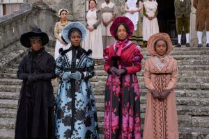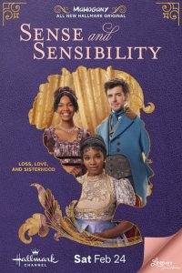
Susan Lawson-Reynolds, Deborah Ayorinde, Bethany Antonia, Beth Angus in SENSE AND SENSIBILITY | ©2024 Hallmark Channel / Steffan Hill
Hallmark Channel has made a lush new adaptation of Jane Austen’s novel SENSE AND SENSIBILITY that premieres Saturday, February 24. The telefilm takes place in the original’s Regency-era England, with a primarily Black cast, headed by Deborah Ayorinde as the principled, passionate Elinor Dashwood.
When Hallmark hosts a Q&A panel and then a luncheon for the Winter 2024 Television Critics Association press tour, the lunch room is decorated with mannequins clad in the elaborate costumes for SENSE & SENSIBILITY. Costume designer Kara Saun is in attendance, wearing a coat she made herself. The coat looks like it should have its own movie: it is black and decorated with patterns of iridescent orange and blue applique.
Saun, whose first television costume design credit came on 1999’s THE QUEEN LATIFAH SHOW, has gone on to design in multiple genres, including for Disney’s musical franchise THE DESCENDANTS, and appeared on twenty-five episodes of PROJECT RUNWAY. She also has her own Los Angeles-based design house, Kara Saun LLC. She takes time to discuss her ravishing creations for SENSE AND SENSIBILITY (this interview combines a one-on-one and comments Saun made on the Q&A panel).
Saun acknowledges with pride that the costumes on display are her designs for the telefilm. “The hats are slightly different, because they couldn’t ship the hats. But the tailcoat and the breeches and the waistcoat is from when Edward [Dan Jeannotte] first met Elinor. One of the scenes that is pivotal for me is when Edward sees Elinor for the first time and falls in love, so I took that in mind when I was designing these costumes – how should she look when she’s sitting down writing in the grass, and then Edward riding up on his horse?”
SENSE AND SENSIBILITY is both Saun’s first Hallmark film and her first set of Regency designs.
“The funny thing is, I love Regency, I love Jane Austen,” Saun laughs. “I have to say, I’ve been waiting to do a Jane Austen project. I’ve seen [the 1995 film] SENSE & SENSIBILITY a thousand times, [the 2005 film] PRIDE AND PREJUDICE a thousand times. I really love the Jane Austen movies. This is my first one, but I feel like I had seen them so many times and done a lot of research, so it was amazing to really dive into doing Regency.”
Saun found herself talking about her time on PROJECT RUNWAY and her love for period with Hallmark Channel executive vice-president Lisa Hamilton Daly, and the network’s African-American brand, Mahogany.
“She said, ‘I think I have the perfect project for you.’ She introduced me to [Hallmark Media senior vice-president of development] Toni [Judkins], and that’s how I got here.”
Regency period films and television often have muted, neutral colors. In this SENSE AND SENSIBILITY, many of the costumes are bright and richly-hued. Was this a major creative decision?
“No, it wasn’t a big decision at all, because I love when someone comes to me and says, ‘Kara Saun, how would you envision this script?’ So, for me, the characters spoke to me. I knew that Toni Judkins had said, ‘We really want to go on our own path, do something unique. We want it to represent Mahogany for Hallmark.’ And so, that’s what I did, taking all those things in mind, but also taking in mind the character and the story and how I saw them, and what colors looked best on each character, and what that color represented for that character.”
“It was really about telling the fashion story, along with the story of all the characters. Elinor starts out in these muted colors of lavender and mint, and it really represented her persona, which was very muted in the beginning. She couldn’t say that she was in love with Edward. And then when you see Marianne [Bethany Antonia], she has all these beautiful, vibrant colors of rose and raspberry.”
Saun adds, “These colors did exist in the Regency era. You may not see it all the time in the Regency-era films, but they’re very a part of the Regency era, and it was just us bringing it to light. There was this mint color. There was this raspberry color. Just think of anything in the color of a flower that you can make into a fabric. When Sir Middleton talked about the Steele sisters, he talked about them being sweet, so I put them in this canary yellow and this pink. They weren’t sweet, you found that out later.”
In fact, Saun says that the first thing she sent to the producers was a color way book. That’s it. No illustrations. I’m just starting with the color. Each character has their own color way. You see the Fanny character. She’s in green, greedy green, envy green. I kept the characters in the color way that, to me, represented who they were, and that’s these really rich and vibrant colors, just like the characters were really rich and vibrant.”
SENSE AND SENSIBILITY was shot in Bulgaria, but, Saun relates, “Most of the fabric that you see in SENSE AND SENSIBILITY is from Mood Fabric here in L.A. I know Mood very well, I use them for all of my projects. There are some beautiful fabrics in Bulgaria, too, but it wasn’t what I brought from Mood. I had already started traveling when one of the costumers said, ‘We don’t have that kind of fabric. You’re going to need to bring it with you.’ I called up Tia [A. Smith], our executive producer, called up Vanessa [Riley, the project’s Regency historical consultant], I said, ‘I am FedExing you a suitcase, it’s going to be full of fabric,’ and they literally brought it on the plane with them.”
Despite the fabric shipping, all of the costumes were actually put together in Bulgaria. “We made sixty-eight pieces in twenty days. And I have to say, we had an amazing tailor team. It was only four – and me, because I had to jump in there,” Saun laughs. “Our lead tailor, Janeya, he’s from Ukraine, spoke four languages, and none of them were English. We were handing the translator back and forth to each other. Just the most beautiful work, and I made sure he did all of Elinor’s pieces, he did all of Edward’s pieces.”
Saun relates, “I look at what other people would think of as a challenge as a really crazy, fun adventure.” The major issue for the costume department “was just the time limit, making sure we got all the pieces in. Like for the ball, I wanted everybody to have a custom ball gown. I didn’t want any rentals. There were certain pivotal scenes, like the first arrival of John and Fanny to Norland Park, I wanted it to be all the Dashwood women standing out there, and you really saw who they were. Even the wedding dress at the end, that was a pivotal moment that I wanted people to really fall in love.”
Saun wants viewers to “zoom in and see the beautiful fabric and the detailing, and see how every piece, every fabric, every detail, there’s a reason for that. [Regency clothes] were always really detailed and decorated, and if you look at all of the costumes here, you’ll see my little details. I love detailing anyway, so the fact that I could detail them in SENSE AND SENSIBILITY was amazing. You can see all the trim, the ribbon – for me, it was another dream come true. Nothing is just by chance, whether it’s the character, the fashion story, the script – every piece that you see, every silhouette, there’s really a reason for it, a reason for being, and I hope you can see those little fashion stories throughout the film.”
Follow us on Twitter at ASSIGNMENT X
Like us on Facebook at ASSIGNMENT X
Article Source: Assignment X
Article: Exclusive Interview with Costume Designer Kara Saun on the new Hallmark Jane Austen adaptation of SENSE AND SENSIBILITY
Related Posts:


